No. of cases
Percentage (%)
Blood relatives
Children
157
51.8
Siblings
43
14.2
Mother
27
8.9
Father
20
6.6
Half-siblings
9
3.0
Other degrees of kinship
4
1.3
Twins
2
0.7
262
86.5
Non-blood relatives
Spouses
27
8.9
Acquaintances
6
2.0
Domino transplants
3
1.0
Relations by marriage
3
1.0
Cohabiting partners
2
0.7
41
13.5
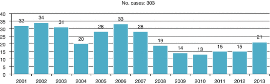
Fig. 3.1
Liver transplants from living donors 2011–2013
Italy currently has living donor programs for kidney, liver, lung, pancreas, and intestinal transplants. Donation from living donors is regulated by a number of provisions and accompanied by numerous guidance documents and ethical statements [12–16]. The feasibility procedures are very rigid and require a number of examinations, both clinical and motivational. The latter are conducted by a third-party commission [15] independently of the recipient’s treatment team (transplant surgeon, nephrologist, etc.).
In no case does donation give rise to direct or indirect payment or to benefits of any kind. Moreover, consent may be withdrawn at any moment, up until the time of the transplant itself. In urgent cases, for which the allocation of organs from cadavers is given priority at the national level, transplants of organs or parts of organs from living donors are not allowed.
3.4 Descriptive Epidemiology of Donations in Italy
In 2000, Italy had an average of 14.3 donors used per million population (p.m.p.) but showed clear and notable differences between the north (21.9 donors p.m.p.) and south (6.0 p.m.p.) of the country. Since then, the number of donors has increased by 4.2 p.m.p. to 18.5 in 2013, but the north-south gap has remained more or less unchanged, notwithstanding the rise in absolute numbers. Certain “virtuous” regions demonstrate that a level of 30–40 donors used p.m.p. is not just a chimera: examples are Tuscany, with 35.1 donors p.m.p.; Piedmont, with 30.2; and Friuli-Venezia Giulia, with 27.1. Other regions, however, are clearly, and objectively, lagging behind: Calabria, with 9.2; Puglia, with 8.6; Basilicata, with 6.9; Campania, with 6.6; and Molise, with 3.2 p.m.p (Fig. 3.2).
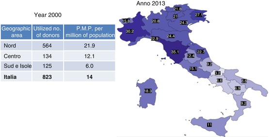
Fig. 3.2
Donors used p.m.p. by geographical region 2000 vs. 2013. Anno 2000 = Year 2000/Anno 2013 = Year 2013/Area geografica – Geographical Region, Donatori utilizzati – Donors used/Nord = North/Centro = Center/Sud e Isole = South and Islands, Italia = Italy – P.M.P. (21.9/12.1/6.0/14.3)
This gap is the principal challenge in the system and prevents us from realizing the concept of social equity and equality of access to the treatment that patients need. On the contrary, it gives rise to, and encourages, flows of patients from the south of the country to regions with better provision. And to a certain degree (fortunately less than in the past), it invites them to seek a solution – one that is not devoid of risks – abroad.
The initiatives undertaken over the years, including the action taken on health planning in a number of regions by pressing for higher donation rates to be given prominence in regional health plans or the temporary transfer of experts from benchmark regional coordination units to those experiencing greater difficulties, have undoubtedly led to an overall improvement in activity levels. A resource-distribution system to provide support for donation and transplant activities has also been proposed and implemented, following an approach that does not simply include but indeed focuses on achieving the objectives. But the different environmental, organizational, and social situations found in the north and south of the country probably still exert a significant influence.
Another factor of interest concerns the causes of death of the donors reported. In the early 2000s, death from vascular causes accounted for 64.38 % of all causes, head injury for 27.26 %, post-anoxia 4.31 %, primary brain tumors 0.99 %, and all other causes 3.03 % (Table 3.2). The epidemiological data for 2013 indicate that in the donors reported, deaths from vascular causes had risen to 69.82 % (an increase of 5.44 %), while those from head injury had fallen to 16.07 % (a decrease of 11.19 %). Other causes remained more or less unchanged (Table 3.3).
Table 3.2
Causes of death of donors reported in 2002
Vascular | Head injury | Post-anoxia | Brain tumor | Others | ||||||
|---|---|---|---|---|---|---|---|---|---|---|
No. | % | No. | % | No. | % | No. | % | No. | % | |
North | 590 | 34.44 | 254 | 14.82 | 42 | 2.45 | 9 | 0.52 | 29 | 1.69 |
Center | 248 | 14.47 | 88 | 5.13 | 15 | 0.87 | 2 | 0.11 | 8 | 0.46 |
South/islands | 265 | 15.46 | 125 | 7.29 | 17 | 0.99 | 6 | 0.35 | 15 | 0.87 |
Total | 1,103 | 64.38 | 467 | 27.26 | 74 | 4.31 | 17 | 0.99 | 52 | 3.03 |
Table 3.3
Causes of death of donors reported in 2013
Vascular | Head injury | Post-anoxia | Brain tumor | Others | ||||||
|---|---|---|---|---|---|---|---|---|---|---|
No. | % | No. | % | No. | % | No. | % | No. | % | |
North | 785 | 34.58 | 164 | 7.22 | 114 | 5.02 | 7 | 0.30 | 49 | 2.15 |
Center | 430 | 18.94 | 105 | 4.62 | 46 | 2.02 | 6 | 0.26 | 30 | 1.32 |
South/islands | 370 | 16.29 | 96 | 4.22 | 37 | 1.62 | 10 | 0.44 | 21 | 0.92 |
Total | 1,585 | 69.82 | 365 | 16.07 | 197 | 8.67 | 23 | 1.01 | 100 | 4.40 |
These figures are in line with the aging of the general population, in which vascular accidents are undoubtedly more frequent. But they also point to the fact that many potential donors are moving into the “senior” age group, a factor that in future could have a growing impact and which will need to be addressed more and more frequently. We will examine this question more closely later. The reduction in the number of deaths from head injuries should, however, provide some cause for relief, as this type of event is typical of the young and very young.
The conclusions to be drawn from these figures become less direct if we analyze them from a geographical perspective. Indeed, if we evaluate the incidence of the various causes of death in the north, center, and south and islands of the country, it becomes difficult, frankly, to understand why, in the period from 2002 to 2013, out of a total of 17,127 potential donors who died from vascular causes, 32.64 % were reported in the north and just over 15 % in the center and south (17.62 % and 16.51 %, respectively) (Table 3.4). The explanation could lie in the higher concentration of elderly people in the north than in the center and in the south and islands, but in this case the figures would run counter to the country’s general demographic trends, which see higher longevity rates in the center-south and islands [17]. Or it could lie in differences of approach in identifying and reporting these potential donors. This seems to us to be the most probable cause, but the figures undoubtedly merit further study.
Table 3.4
Causes of death of the 25,646 donors reported from 2002 to 2013
Vascular | Head injury | Post-anoxia | Brain tumor | Others | ||||||
|---|---|---|---|---|---|---|---|---|---|---|
No. | % | No. | % | No. | % | No. | % | No. | % | |
North | 8,371 | 32.65 | 2,772 | 10.86 | 939 | 1.31 | 99 | 0.38 | 534 | 0.98 |
Center | 4,521 | 17.62 | 1,338 | 5.21 | 300 | 0.39 | 70 | 0.27 | 264 | 0.36 |
South/islands | 4,235 | 16.51 | 1,478 | 5.76 | 245 | 0.34 | 68 | 0.26 | 312 | 0.43 |
Total | 17,127 | 66.78 | 5,588 | 21.78 | 1,484 | 5.78 | 237 | 0.92 | 1,210 | 4.71 |
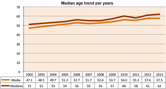
Another factor of interest, as we have just mentioned, is the age of the donors reported and how this has changed over time. To give this variation its due prominence, we considered the donors used. In 2002, their mean age was 47.1 years and the median was 51. By 2013, the average age had risen to 57.5 and the median to 62. In practice, the population of donors used has “aged” over the period by 10 years (average value) and 11 years (median value) (Fig. 3.3).
 Infection Complications After Abdominal Organ Transplantation
The Intraoperative and Perioperative Management of Kidney Transplantation
Indications and Timing for Intestinal/Multivisceral Transplantation
Infection Complications After Abdominal Organ Transplantation
The Intraoperative and Perioperative Management of Kidney Transplantation
Indications and Timing for Intestinal/Multivisceral Transplantation
 Renal Transplantation: Kidney Procurement from Cadaveric Donors
 Percutaneous Treatment of Biliary and Vascular Complications
 Intestinal/Multivisceral Transplantation


Related posts:
Infection Complications After Abdominal Organ Transplantation
The Intraoperative and Perioperative Management of Kidney Transplantation
Indications and Timing for Intestinal/Multivisceral Transplantation
Renal Transplantation: Kidney Procurement from Cadaveric Donors
Percutaneous Treatment of Biliary and Vascular Complications
Intestinal/Multivisceral Transplantation
Stay updated, free articles. Join our Telegram channel
Full access? Get Clinical Tree
