, Mark Thomas1 and David Milford2
(1)
Department of Renal Medicine, Birmingham Heartlands Hospital, Birmingham, UK
(2)
Birmingham Children’s Hospital, Birmingham, UK
Abstract
In this chapter we explain:
The importance of plotting a complete eGFR graph
How to analyse variation in eGFR over time
How serum creatinine changes in acute kidney injury
How acute and chronic kidney disease are interlinked
Good doctors are skilled at taking a patient’s history. As Sir William Osler 1 famously said: “Listen to your patient, he is telling you the diagnosis”.
But patients with kidney disease often have no symptoms, so Osler’s advice can be modified to: “Look at your patient’s eGFR graph, it is telling you the kidney history”.
In other words:

Viewing the results as a column of figures is not enough; your brain cannot adjust for the different time intervals between the results to see the trends. Also, there may be so many results that you cannot view them all at once. Simply drawing a graph overcomes all these problems [1].
The graph helps both clinicians and patients to make sense of what is happening. And with this understanding, the patient is more likely to be motivated to modify their lifestyle or adhere to a drug treatment.
The more complete the dataset the better. It may require some detective work and telephone calls to pathology laboratories to track down all the old results (Patient 3.1). You may need to convert previous serum creatinine results into estimated GFR values, as explained in Chap. 2. These GFR estimates may be less accurate than those provided by the laboratory as they may use uncorrected serum creatinine values. However, they give valuable information about long-term trends in kidney function.
Patient 3.1: Hunting Out the History
Arthur, a 70 year old man with diabetes, was referred by his GP for advice about how to improve the control of his blood pressure and glucose. This is a table of his eGFR results for the previous 2 ½ years (Table 3.1).
Table 3.1
Sequential eGFR results over 2 ½ years
eGFR | |
|---|---|
18 Apr 2011 | 51.3 |
07 Nov 2011 | 47.8 |
10 Feb 2012 | 52.0 |
23 Jul 2012 | 37.9 |
20 Aug 2012 | 51.5 |
10 Oct 2012 | 56.4 |
29 Jul 2013 | 44.5 |
30 Oct 2013 | 46.1 |
The variation in the time intervals between the results makes it hard to interpret the table of numbers. A graph of the results resolves this problem (Fig. 3.1).
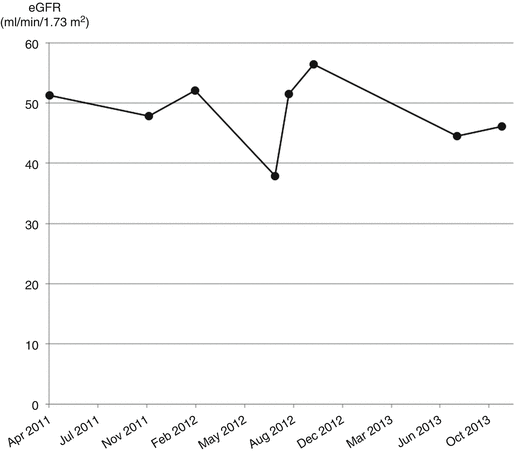
Fig. 3.1
Trend in eGFR over 2 ½ years
The variation between these results makes it difficult to estimate the rate of decline in GFR. Further searching of the laboratory database uncovered some older results that had been stored using a different patient identification number. The pathology database had not automatically merged these with the more recent records. When this was done manually, the trend over 10 years was revealed (Fig. 3.2).
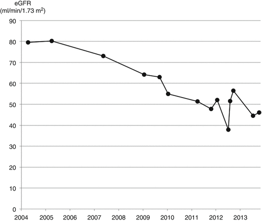
Fig. 3.2
Trend in eGFR over 10 years
Once you have tracked down all the eGFR results and plotted a complete graph, the next step is to interpret it correctly.
Analysing Variation in eGFR
If you took blood from the same person every day for 1 week, the seven serum creatinine results would not all be the same. They would vary above and below an average value. This is caused by variation in the person’s true GFR from day to day combined with variation in the laboratory assay.
The minimum difference between two measurements that is statistically significant is called the Reference Change Value (RCV). The RCV is calculated by combining the biological and analytical variation of the substance being analysed. The RCV for eGFR at an eGFR of 60 is 10 ml/min/1.73 m2. At an eGFR of 30 it is 6 ml/min/1.73 m2 [2].
These figures suggest that eGFR is an insensitive way of measuring changes in kidney function. However, the RCV is a statistical comparison of only two values. Patients with kidney disease usually have many more than two readings to compare. Comparing multiple values averages out the analytical variation, making the trend in the eGFR a reliable and sensitive way to detect change in kidney function [3].
When we analyse a series of eGFR values we want to know whether the latest result is significantly different from the previous ones. Does it indicate a real change in the patient’s health or is it within the expected range of variation of their known condition. In other words, is the patient’s kidney function stable?
‘Stable ’ is used as a mathematical term. It means that both the mean eGFR and the range of variation either side of the mean are constant over time. If the eGFR is stable, the mean is stationary and there are no non-random signals.
The comparative statistics used in the RCV are not helpful for analyzing sequential or time-series data. We need to use different statistical tests.
To test whether the output of a process is stable, sequential data are plotted on a chart called a run chart. The eGFR graph is a type of run chart. If we have sufficient data points, usually more than 20, the range of expected variation can be estimated using Statistical Process Control (SPC).
To perform an SPC analysis, upper and lower control limits , sometimes called natural process limits , are drawn on the chart. They indicate the range beyond which the process output, in this case the eGFR, is statistically unlikely to occur by chance, i.e. about 3 in a 1000. If the variation remains within the control limits, the process is said to be stable. If data points deviate outside the limits or meet statistical tests for a non-random pattern, the process is unstable and a ‘special cause ’ is indicated [4].
An SPC chart can sometimes be helpful for analysing a series of eGFR results.
Patient 3.2: Using an SPC Chart to Analyse Variation in eGFR
Marjorie was aged 82 and had CKD stage 4 due to diabetes and hypertension. Her eGFR was stable over 5 years. She then presented to hospital with cellulitis of her leg and hypotension. She was treated with antibiotics and allowed home.
Reviewing her eGFR results, the value on presentation was below the lower control limit (LCL) on a SPC chart drawn using all her previous results (BaseLine©, www.SAASoft.com) (Fig. 3.3). This was a warning that the sepsis was affecting her kidneys.
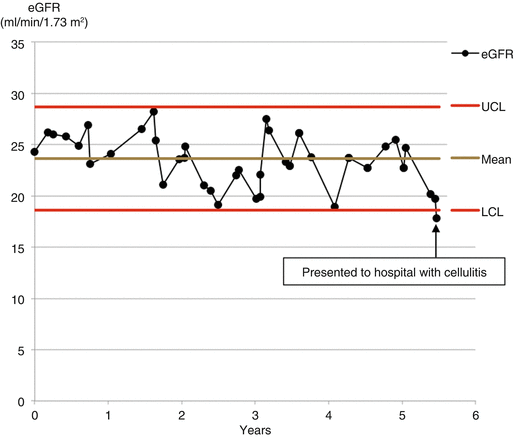
Fig. 3.3
Statistical Process Control chart of eGFR values over 5 years. When the patient presented to hospital with cellulitis, the eGFR was below the lower control limit. This indicates that the deviation was significantly greater than expected from the previous normal variation for the patient. UCL upper control limit, LCL lower control limit
Six weeks later she returned to hospital more unwell. Her eGFR had dropped to 5 ml/min/1.73 m2. The clinical significance of the value taken previously was now clear (Fig. 3.4).
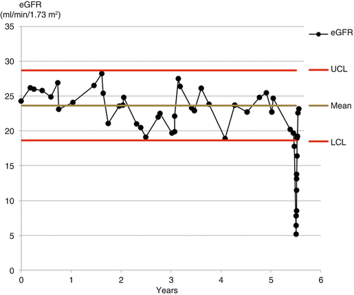
Fig. 3.4
Statistical Process Control chart showing acute kidney injury with recovery to previous baseline. UCL upper control limit, LCL lower control limit
With intensive treatment over the following month her eGFR returned to its previous mean baseline.
Unfortunately, an SPC approach to analysing eGFR results is usually not possible for a number of reasons. Firstly, measurements of eGFR may be too infrequent or few in number to provide a reliable baseline. Secondly, kidney function is more likely to be measured when a patient is unwell and so the results may not be representative of the healthy baseline. And finally, the underlying GFR is often declining over time and so the mean is unstable. An SPC chart cannot be used to interpret variation about an unstable mean.
Interpreting Variation in an eGFR Graph
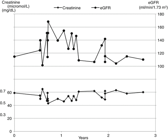
Variation in eGFR is greatest at low levels of serum creatinine because of the inverse relationship between creatinine and eGFR. Figures 3.5 and 3.6 are charts from two kidney transplant patients. The first patient (Fig. 3.5) has good transplant function and normal serum creatinine; the average eGFR is high and the variation is wide. The second patient (Fig. 3.6) has poor function and high serum creatinine; the average eGFR is low and the variation is narrow.